Wednesday, March 13, 2013

Learning Solutions 2013 - Day One

I don't seem to have wi-fi in my hotel room, so I'm doing this (and likely all) blog updates from the exciting hotel lobby. Yeah! Oh wait, not... not so yeah.

Thankfully, other than the wi-fi situation, the conference has been great so far. Here are some of my reflections about the day:

Session: Morning Buzz: Getting Creative
Speaker: Connie Malamed

Obviously I didn't live tweet this one. I hadn't ever attended one of the more casual Morning Buzz sessions that happen at the eLearning Guild conferences so I just sort of wanted to check it out and see what it was before committing to broadcasting it.

This session turned out to be an easygoing chat where the group just talked about what creativity is, tools you can use to boost creativity, and creative projects we were proud of making. There was a small group of people at the session who had both learning AND fine art experience (myself included), so for me it was particularly interesting to hear suggestions from them on how to keep creativity fired up.

Some of the best suggestions from this session were the ones near and dear to anyone who's ever worked in the arts hearts: keep experimenting, sketch and sketch and sketch, and the beginning of any creative process is throwing a bunch of ideas out there and then scrapping everything but the best of the best. Additional funny-yet-useful suggestion: if you work with/for people who are creativity-adverse, find ways to "cloak your creativity in mediocrity" (if I ever form a punk band, that is what I'll call it).


Session: KEYNOTE: Exploring the Role of Technology in Peak Performance
Speaker: Robert Ballard

The opening keynote was a speaker I remember studying in elementary school: Robert Ballard - ocean explorer. I'll be honest, the session wasn't as connected to the conference themes as I would have liked, but it was deeply enjoyable nonetheless.

Ballard talked about his career, in particular the way his out-of-the-box way of looking at solving problems helped to make amazing discoveries about our oceans (and the shipwrecks in them). The great thing was, this wasn't him doing the whole humblebrag thing. He was legitimately excited and happy that his unusual approaches to oceanography had helped science on a whole. He thought it was important to share examples of when looking at a problem differently helped, not so much that it was HIS non-standard ideas that made the advancements. Always a classy move.

There are two main things that I got out of this session. First, that it's vital that we have people in STEM fields act as advocates for making science approachable. People like Ballard (and his astrophysics counterpart Neil deGrasse Tyson) do wonders for making science something that anyone can wrap their heads around. In particular, Ballard's work with schools around the world is making science just plain fun for kids. Second, it's important to love what you do. Ballard talked about how lousy the conditions were in early exploratory subs. You HAD to love it or else it would drive you batty. Plus, he's 71 years old and still talking about what he does with passion and excitement. That's most assuredly something to want to emulate.


Session: Ideas You Can Play With
Speaker: Stephen Anderson

Next up was a session on, as Anderson put it, how new ideas come from "the intersection of fields, disciplines, or cultures." The session was predominantly examples of how tech is evolving in all sorts of exciting ways and felt like more inspiration than advice on application (not a complaint in this particular case).

While I'd be writing all night if I tried to sum up every example he used, I would like to point out my favourite: interaction design. He spent a not insignificant chunk of the session showing examples of how playful interaction design helps people better visualize and explore their options, as well as bump into new options they never would have considered (or even expected) otherwise. There's something to be said for finding a way to make people want to play with information. It gives people more say in their choices, but without having to slog through tons of poorly collected and curated info. Anytime you can simplify things without dumbing it down is valuable for a learner.

There are clearly a lot of tech innovations evolving every minute, but not every one of them is the best for you just because it's new. That's why I'm glad Anderson remembered to mention that this shouldn't just be tech for tech's sake. Hooray for acknowledging that "new" doesn't always mean "improved for every situation."


Session: Tips & Tricks for Building Great Whiteboard Videos on a Budget  Speaker: Cory Casella

Practical application? A session after my own heart. Much like the title suggests, Casella went through the steps involved in creating whiteboard videos (like the ones RSA Animate does) on the cheap, start to finish. Casella is planning on making his instruction manual-like deck (and I mean this in the best way possible) available online, so I'll link to it later rather than try and recreate it here. Before it goes up, though, I can say that at the end of the presentation I was fully reassured that I could replicate his process for under $650 in supplies/equipment. Can't complain there!


Session: Mobile Delivery of Educational Materials to NFL Players - Lessons Learned    Speaker: Alexander Grosholz

I hate writing negative reviews, but this wasn't my favourite session. Grosholz is a deeply likeable speaker, but I think I was hoping for more from his content.

The session was a case study in how he had used two different delivery methods to move the Miami Dolphins from printed to digital playbooks. They started using a bring your own device (BYOD) set up, but found that supporting content on multiple devices (and operating systems) was tricky, people on Android and BlackBerry platforms weren't actually using the digital playbook (I'd love to figure out more about why this was the case in this situation), and, worst of all, people were still relying heavily on printed materials.

A second launch using Corporate Owned, Personally Enabled (COPE) iPads worked substantially better. Everyone was on the same device, so it was (relatively speaking) easier to set the system up and support it. Since the devices were corporately owned, that meant that they had more control over them, allowing for extreme actions such as a remote device hard drive wipe in case a tablet was lost (important for the security of a team playbook) with little drama. Because the iPads were company property, they also were able to institute stiff fines if a device was misplaced, adding again to security. However, because the devices were in the hands of Dolphins employees, they could still be customized and used mostly as they pleased, adding to personal enjoyment of the device.

So, interesting, but I didn't love the session. I honestly was hoping for more information about how the digital playbook functioned, the thought process of how it was created, and how their security measures worked specifically, but instead got a case study of why they went with COPE instead of BYOD. So, not what I was expecting. Plus, the speaker's slide deck was just bullet after bullet instead of screen shots or other visual media. The deck was the polar opposite of engaging, and I think the speaker would have been better to have no deck than THIS deck.

So, not a train wreck by any means, but not my favourite.


Session: KEYNOTE: Lessons Games Teach Us About Enhanced Performance Speaker: Aaron Dignan

Last, but not at all least, was my favourite presentation of the day (and likely to be my favourite of the conference). Dignan combined all the best examples of a good speaker. He took a topic he was an expert at and made it completely accessible to newbies (without dumbing it down too much for other experts), he incorporated easy to understand examples to back up his points, his speech was simple yet precise, the material was well organized, and his slide deck was stunning (seriously, go look at the photos of it I tweeted. It's awesome AND contributes to his content).

Admittedly, I liked the session a great deal because Dignan talked about something I care a lot about: games. In this case, he talked about games from the perspective of why they're interesting and what we can learn from them as learning designers. As he put it "play is nature's learning engine" and we see all sorts of creatures, human and otherwise, who use play as a way to understand the world (and the boundaries of that world) around them. So why should we suddenly stop using this method of learning when we become adults?

For optimum game/learning enjoyment (and hitting that delightful flow state that makes the hours fly by when you're grinding away at leveling up in a game), you need to find the delicate balance of challenge and skill. Too easy makes people bored. Too hard makes people frustrated. Just right and people feel challenged but not overwhelmed. This works just as well in learning as it does in traditional games.

Games also give us a safe arena to take risks. You can make mistakes with minimal long term ramifications. In real life, however, we tend to play it safe as most IRL mistakes have much more severe IRL consequences. This means we can become too unwilling to take the valuable risks that are vital to innovation and experimentation. Learning should take the game approach to mistakes: give people a place to make mistakes, get feedback, and try again without severe punishments (a fantastic case, might I add, for high quality simulations). In this same vein, games also give us an opportunity to practice... and practice... and practice again! It's hard to find a more effective path to mastery than simply practice.

Dignan mentioned a number of examples of games weaving themselves into other aspects of life: Target's gamified cashier feedback system, Stack Overload, Open Badges, Microsoft's imbedded Office training game, just to name a few, are all interesting examples of just some of the ways game elements have entered other arenas. How we continue to do this, in particular as educators, remains to be seen.

So this is all great stuff, sure, but I think the reason I liked it so much is that Dignan did a superb job of explaining what exactly games are and why they appeal to the human brain. Too many people get involved with gamification and serious games without wrapping their heads around what exactly makes a game a game in the first place. That's why, I suspect, we see so many instances of lame "slap badges on it and call it a day" gamification these days. In helping the audience to actually "get" games, I suspect Dignan did a lot to help influence better game-inspired learning from the audience.

And so...


So that's my impressions of the first day of Learning Solutions. I had intended to cap off the night with the official conference "game crawl", but I never ended up figuring out where exactly the "hotel bar" was (thought I found it... must have been a different bar), and so I'm a sad panda who won't get to play Ticket to Ride with anyone tonight. Don't feel TOO bad for me: I'm just going to play the iPhone version in my hotel room instead.

Tomorrow has a number of great events, but what's top of mind for me is my first conference presentation (Graphic Design Tips for Non-Designers... I'd love to see you there at 10:45am!). I remain both giddy AND nervous, so the only logical thing to do is rehearse it yet again and then get a good night's sleep.

See you tomorrow con-goers (on-site and remote alike).

Tuesday, March 12, 2013

Learning Solutions 2013 - Pre-Conference Impressions

Well, I've been in Central Florida for half a week already visiting family, but I'm only now finally checked in to the conference hotel in Orlando. So, I suppose today is the beginning of the conference portion of my trip.

Before I mention my pre-conference impressions, I should mention that my only conference to compare this one to is DevLearn... which is held at the Aria... in Las Vegas. So, any comparison is likely to come out in favour of the location that was practically built for conventions.

So, the hotel. It's nice enough, but after DevLearn is feels so very small. Now, this can be a good thing. It means that tomorrow when I drag my sorry carcass out of bed to attempt to be coherent at the 7:15am Morning Buzz session, at least it won't take me more than a few moments to get from my room to the session. In Vegas you had to plan an absurd amount of time to even get from one part of the hotel to the other.

The smallness also means that the likelihood of bumping into a fellow Learning Solutions attendee is quite high. I rather like that. Unfortunately, no one is wearing their con badges right now, and I completely suck at identifying people from their tiny Twitter photos, but I suppose this will go better when we're all tagged and name badged tomorrow.

My room here is fine, but sadly doesn't have the frankly spectacular bathtub that the Aria rooms have. I'm not even a big bath person myself and I still fell half in love with that thing. On the plus side, at least the hotel rooms here don't automatically play terrible music the moment you walk in. That's a real plus.

As for attractions, yeah, there's no Vegas strip, but there IS, you know, Disney and all. Plus I think as conference attendees that we can get discounted "After 4pm" tickets for the parks. I am absolutely heading off for a discounted trip to Epcot on Thursday as a reward for surviving my concurrent session.

Overall, this seems like a cosier conference overall. If you're looking for a big event, this might not be your cup of tea. But if you're looking for something a smidge more intimate, I'm getting the feeling that Learning Solutions might be the right fit.

Monday, March 11, 2013

What's my Learning Solutions 2013 session about anyway?

There are few things more frustrating at a conference than getting excited about a session only to realize part way through that it isn't what you expected it to be.

You know how it works, you read a session description, plan to attend it, park yourself in the front of the session room, and then 5 minutes in you realize you've made a big mistake. Maybe the session description was a bit inaccurate, maybe the content is more basic or more advanced than you originally suspected, or perhaps the speaker wants to focus on a facet of the topic that just doesn't really interest you. Regardless, it's frustrating... especially if you happen to be seated somewhere where you can't escape the room discreetly.

Later this week I'm presenting a concurrent session at Learning Solutions in Orlando and the absolute last thing I want is for people to attend my session thinking it's going to be one thing and then being disappointed that it's something else. To prevent this, I thought I'd do a quick posting about what to expect if you come to my session.

What is it & when it is happening?
My session is Designing For Clarity: Graphic Design Tips for Non-Graphic Designers and it's taking place on Thursday from 10:45am-11:45am in the International North room.

What's it going to be about?
The session description is, happily enough, quite accurate.

Good design isn't just pretty: it can also do a lot to help learners understand your content quicker and feel less intimidated or frustrated with training in general. Clear design is absolutely worth spending time on, but the reality is that many of us don't have constant access to a graphic design team to help us out. That's why, even if you can barely draw a stick person, it's still valuable to have some basic design knowledge that you can use any time you have to create a document, PowerPoint deck, website, e-Learning lesson, or anything else on your own.

In my session I'm going to break down what exactly contributes to clear design. I'm also going to discuss simple tips and guidelines that even beginners can use immediately to create better designed projects.

Everything in the session will be focused on practical, use-on-Monday solutions. The content will also prepare you for continuing to learn about graphic design in the future.

Who's the right audience for this session?
First, the session is a great fit for anyone who has little to no design experience and would like to know more. Even people who don't directly design learning content themselves, but are asked to create presentations and documents for work, will get a lot out of this session.

Second, if you already work with graphic designers, this session can still give you a better understanding of what guides the design choices they make.

Finally, if you're someone who has a great understanding of design but is looking for some tips they can share with non-designer co-workers, this session might be for you as well.

What if I'm still not sure if this session is for me?
Definitely feel free to ask me more about it. Email (BiancaRWoods@gmail.com) and Twitter (@eGeeking) are great ways to reach me, but I'm also happy to chat about it if you happen to bump in to me at the conference.

Tuesday, March 5, 2013

My Learning Solutions 2013 schedule


I'm headed out to Learning Solutions 2013 later this week and, as now seems to be my habit, I'll be contributing to the back channel in order to help my coworkers, Twitter followers, and blog readers who can't be there themselves virtually attend. Much like at DevLearn 2012, my plan is to live tweet the sessions I attend and then create day summary blog posts.

Barring the wi-fi being terrible and/or any of the sessions being particularly awful, this is what you can expect to see me reporting on from March 13-15 (Note: the times listed are all in EST):


Wednesday, March 13

8:30am-10:00am 

10:45am-11:45am

1:00pm-2:00pm 

2:30pm-3:30pm 

4:00pm-5:00pm 


Thursday, March 14

8:30am-10:00am

*10:45am-11:45am
*Note: This is actually my session, so I won't be live tweeting it. However, I will make my session materials available via a link posted on Twitter around this time.

1:00pm-2:00pm

2:30pm-3:30pm

4:00pm-5:00pm


Friday, March 15 

8:30am-9:30am

9:45am-10:45am

Thursday, February 21, 2013

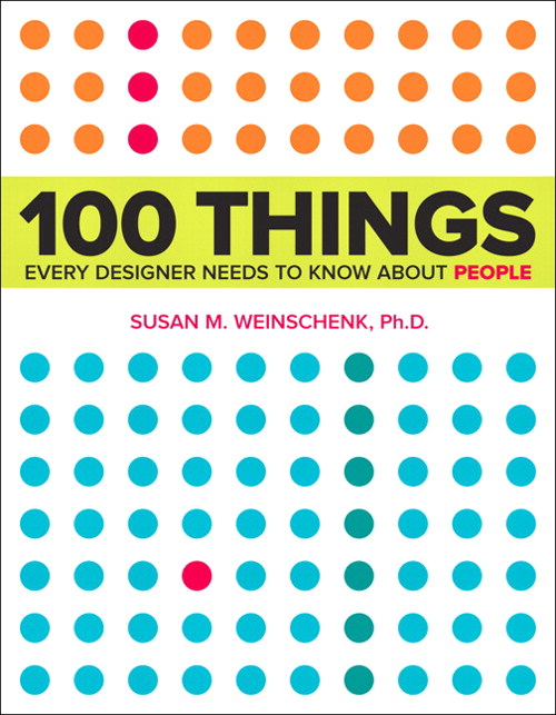
Review: 100 Things Every Designer Needs to Know About People

Work is making me do a book report... A BOOK REPORT!

Okay... by "making me" I mean I volunteered to speak about something I liked at this week's Instructional Design lunch & learn, and now we have to write about what we talked about. I reviewed a book, therefore I'm writing a book report.

Admittedly, it sounds way more amusing the way I initially put it.

Anyway, since I'm writing up this book report for work I figured I may as well share it here too.


Title: 100 Things Every Designer Needs to Know About People
Author: Susan Weinschenk

What's it about?

Never before have you read a title more accurate. It's exactly what it says it is: 100 facts about people (and specifically their minds) that designers, or anyone really, should know.

What's so great about it?

This isn't just a collection of facts based on someone's gut feeling: every point is based on scientific research. This book talks about topics like how people make mistakes, focus their attention, remember, and are motivated, all in layman's terms. It then tells you how you can use these facts to your advantage when designing anything.

So it's brain science in easy to digest nuggets that will help you design your learning/websites/textbooks/apps/whatever in ways that are more effective. Plus, it identifies its sources, so you can check the science for yourself.

What's going to drive me nuts about it?

Because it covers so many individual topics, trying to read this thing cover to cover will give you brain overload. I'd usually make it though about 5-10 topics in a sitting and then have to stop, put the book down, and process. And I say this as someone who's usually happy to read constantly for hours. It's good, but it'll likely be a slow read.

Anything else?

The colour scheme of the book is ridiculously pleasing (what, these things matter to me!).

I'm too lazy to Google the book. Where can I buy it?

*sigh* Here you go:

Monday, February 18, 2013

What Games Aren't

Gamification is definitely one of the more polarizing topics to bring up in instructional design communities these days. That said, let's put the whole "is gamification bad or good" discussion on the backburner for now and acknowledge the fact that, regardless of how any of us feel one way or the other, gamification projects are definitely happening. Unfortunately many of these projects are being proposed by people who don't understand games in the first place.

I've been a gamer longer than I've been an educator, so I admittedly have more than a bit of emotional investment in wanting people to see the value that games have beyond "for funsies". I think that's why I get so frustrated when I see people and companies trot out gamified learning that clearly has made some bizarre and inaccurate assumptions about games in general.

So, from this gamer to non-gamers everywhere, here are two assumptions about games that I'd LOVE people in our industry to stop making.

1) Learning content + a game-like setup = better learning

Shoving the facts you want learners to know into a game doesn't always lead to good bang for your buck. Just ask anyone who grew up in the 80s. We were subjected to a major wave of educational games, many of which weren't particularly effective. Sure, we have fond memories of titles like The Oregon Trail and Sim City, but for all the endless hours of play time we put into these games I think it's safe to say we didn't actually learn much from them.

The intent was good: create engaging games that will also pass on knowledge to the player. Unfortunately, most of what kids learned from these games was simplistic surface information. I mean, seriously, no matter how long you play The Oregon Trail the most you're going to get out of it is that inventory control is important and dysentery is bad. That's not a lot of learning considering the average amount of time a player spent with the game.

Modern gamification sometimes suffers from this problem as well. The group working on the project is so excited about the idea of a gamified system that they don't realize how little their game is actually teaching. Just because something has been turned into a game, doesn't mean that it's actually going to impact the learner much.

2) All games are fun

Games are fun, that's why gamification keeps learner interest, right?

Um... no. Some games (depending on your standards, MANY games) are unbearable, unenjoyable pieces of junk.

Non-gamers typically only have exposure to successful games. You know, things like World of Warcraft, Halo, Angry Birds, or Super Mario. They rarely have much experience with the real gamer experience: wading through a myriad of shoddy, half-baked games in order to find titles that are actually worth your time. Some of these are legitimate efforts to make something great that just didn't turn out as planned, some are cheap efforts to cash in on a trend or licensing tie-in, but regardless of intent, many are just plain not fun at all.

For a great example, check out the 1982 Atari game E.T. the Extra-Terrestrial, a title notoriously considered the worst videogame of all time. This cheap attempt to take advantage of the popularity of the movie lead to a game that's by all accounts tedious and incoherent. Here, see for yourself:


Google "worst videogames" and you'll get list after list of games this bad. Clearly the mere act of using game elements does not, in fact, lead to an enjoyable experience. But, unfortunately, there are way too many people making gamified systems who don't understand this simple fact.


So if you or someone you work with has been asked to create a gamified system make sure you start off with the following:

  • Involve someone who already "gets" gaming.
  • Try playing games yourself and get a feel for the experience. Play both excellent games AND terrible ones so you can learn the difference.
  • Continually check that the gamified system you're designing is actually teaching something both meaningful and worth the investment of player time.
But before you do any of this, really ask yourself if a gamified system is actually the right tool for the job. It's surprising how often it actually isn't.

Sunday, February 3, 2013

Let's chat about skeuomorphism

I had planned to write a detailed post on skeuomorphism, but then Scientific American beat me to the punch with this article that sums up a lot of what I was thinking. So, instead, I'm going to write post on what I feel the article left out. Your pre-work is clearly to go read the article if you haven't already... don't worry, I'll still be here.

...

Good. Now we're all on the same page.

Here's the thing: I don't believe skeuomorphism is inherently bad design. Think about things like the Trash or Recycling Bin on a computer. Even to the biggest technophobe its purpose is instantly understood. That's good design at its finest.

Even my dad knows what this does. That's a miracle.
Skeuomorphism works, I mean REALLY works, when it's being used to acquaint people to something new by using the look and feel of something they already know. It's also good for triggering the emotions people have about the product it's replacing (I know not everyone feels this way, but the page turn effect in iBooks always triggers that love I have for the traditional paper book experience). Finally, when done right, it sometimes just looks cool.

But when skeuomorphism goes bad, boy is it ever terrible. Some people make the mistake of seeing it as the pinnacle of design when in reality it's just one of a myriad of great options that should only be picked if it's the right tool for the specific task you're trying to accomplish.

As I see it, there are two main ways people tend to shoot themselves in the foot with skeuomorphism:

1) Form over function
I'm all for designing things that are attractive, but the job of great design is to make sure that the beauty of the thing you're designing doesn't interfere with the functionality of what it's actually supposed to do.

Here's a hypothetical example. Let's imagine someone designed a delightful phone app that both resembled and functioned like an old rotary phone.

Man, does looking at this thing make me feel old.

Great. Rotary phones have a certain charm to their look and a fun retro appeal... Where's the problem?

The problem is functionality. Who here remembers how slow it was to dial on them? It was painful how long it took to dial a simple number (and heaven help you if you had to make an international call). This is an instance where there was a distinct reason phones with a touchpad took over, and also distinct reason the touchpad design is what smartphone makers decided to emulate for phone apps. It's a noticeably faster and more efficient experience.

While the design of a skeuomorphic rotary phone app could be stunning to behold, the actual user experience would be so much worse than the alternatives that most people would reject it. Form over function is always bad design.

2) Forgetting that just because it looks like a real thing doesn't mean that it isn't also hideous
And here's the real problem with Apple's recent attempts at skeuomorphism. Apple is a company that for years had been known for being on the cutting edge of sleek and sophisticated design. Then they gave us this:

Ugg! My Eyes! The horror!
And people flipped out. The colour... the faux leather... the terrible fake stitching. This was some deeply ugly stuff coming out of Apple for the first time in a very long time, and the aspects about it that were so painful were the ones associated with skeuomorphic design.

Because of this, a large number of people concluded that skeuomorphism was inherently a bad design choice. However, I'd argue that this proves no such thing. The real problem here is that the designers phoned in the look and feel of the newer Apple designs, depending on the misguided idea that simply following the principles of skeuomorphism would make something that looked great.

Look, there is no magic formula for design. Give me any design principle you can think of, and I'm sure I can find you plenty of instances when people have made a fugly mess while using it. Apple made the mistake of being so focused on replicating the look and feel of a leather notebook that they forgot to check to see if said leather notebook was actually attractive.

It wasn't.

That's not a problem of skeuomorphism, it's just pure bad design, and unfortunately it's given skeuomorphism a bit of a bad rap.


So that's my take on the whole skeuomorphism issue. I'd love to get your opinions on it. Also, it would be fun to get some additional examples of times you've seen it done either brilliantly or painfully poorly.

Sunday, January 13, 2013

Making the best of a bad situation: reflections on a lousy class

I love making stuff. Seriously, it brings me absurd amounts of joy to take a bunch of unformed things and turn them into a usable item. So it's no surprise that when I found out my local college had millinery courses I immediately signed up for one. I mean, I like making things and I'd always wondered about hat construction, so it seemed like a no-brainer. This should have been a class I loved attending, right?

As it turned out, not so much.

The course was a terrible combination of a teacher who didn't understand how people learn, a curriculum that was written with little thought for the audience, and a class environment that quickly turned angry and toxic. Basically, the exact opposite of the relaxing and educational experience I was looking for.

In attempting to find value in what can only be considered a horrid experience, I decided to look at the whole experience from the perspective of an instructional designer. If I couldn't enjoy it for what it was, I could at least learn from it as an example of what not to do, right?

So here are some of the key things I took from the experience:

Never assume that just because a person is an expert at a task/role that they're ALSO skilled at teaching it
My instructor was an incredibly talented milliner and clearly passionate about technique and the history of her craft. Unfortunately, none of this translated in being able to teach people about hat making. Unable to put herself in the mindset of a beginner, she gave instructions that jumped around, skipped steps, and were on occasion completely incorrect. Then, when the class couldn't keep up, she'd berate us and insist that we were having trouble because we weren't paying attention, or reading our notes, or skilled enough. It was all us and never her.

I've seen this happen a number of times. Someone is brilliant at what they do, so it's assumed that the're the perfect person to teach others about that topic. Knowing a topic and being able to teach it to others, however, requires two completely different skill sets. An instructor should be chosen because they know their topic, that's a given. But equal, if not slightly more, weight should be given to their ability to translate advanced knowledge into a form that's digestible to newbies. So either hire instructors that already know how to do this, or train your experts on teaching techniques before you let them anywhere near a classroom.

Just because your teachers/facilitators are teaching adults, doesn't mean they don't need classroom management skills
The students were confused by the lessons and frustrated with the instructor... the teacher didn't understand why her students couldn't keep up... as you can imagine, the class turned ugly. Several students got angry in class and one turned out to be a spectacular bully to classmates and and the instructor alike. The class became out of control and the instructor didn't seem like she knew how to reel it back in.

I think some people assume that classroom management skills are just for teachers who deal with kids. They aren't. No matter how old the learners are, there's still value in making sure your instructors know how to guide groups and diffuse tense situations effectively. In this case, an instructor with great classroom management skills could have done a lot to nip bad habits/bullying in the bud and turn the mood of this class around. Institutions need to make sure they arm their instructors with these skills and support them if a class goes sour.

There are still many instructors who don't understand how the internet and technology can help them
For a number of reasons, our instructor didn't have access to an in-class sewing machine. This meant that she couldn't actually show us a number of the techniques we needed to use when making our hats at home. As you can imagine, this lead to many of us struggling to learn from terribly written instructions (and failing miserably). Several of us took matters into our own hands and looked for help on YouTube, but the videos we found didn't always align with how our instructor wanted us to do things. When the instructor gave us project feedback, she went off on a rant on the poor quality of instruction found online. She just emotionally shut down about the internet having any value for her class.

The frustrating thing, as anyone who's ever used YouTube or other online resources to learn a skill could tell you, is that the internet is a fantastic place to learn. Yes, you need to evaluate your sources carefully, but if you can do that then you're set. YouTube in particular could have been a perfect solution to our class' dilemma: our instructor could have curated a channel of videos that displayed the techniques done in the way she wanted and then simply given us all a link to the channel. But because her beliefs about the internet didn't reflect the reality of what was there, she couldn't wrap her head around this idea even when it was suggested.

For those of us in instructional design and training, it's important for us to remember that we're going to encounter people like my instructor: people with preconceived or out of date notions about what technology can and can't do for learning. We need to be aware enough to notice when we're talking to people like this and continue to look for ways to adjust their perceptions in a supportive way.

It's worthwhile to learn a wide variety of skills
Okay, so the class was awful and I'm never going to be a professional milliner, but by the end I could at least say that I understood hat construction in ways I hadn't before. The skills I learned mean I'll be better at assessing the quality of hats I'm considering buying. I also have a much better understanding of why a well made hat costs so much. Plus, the entire experience pushed me to be creative in ways I hadn't ever been before. Those are skills that, for me, are worth having.

Experiences like this are why I believe so much in pushing yourself to learn skills far outside of your comfort zone. They give you insight into other people's jobs and help you appreciate how much time and energy goes into the things you might take for granted.

Take a Flash course on Lynda.com so you can see why it takes your development team so long to build an e-Learning course from scratch, try a sewing course at Craftsy.com so you you can pick out clothing based on construction quality, or take a woodworking class so you can understand why good furniture costs so much more than what you get at Ikea. Broadening what you know about is always worth the effort.


It was a terrible course, but I did learn enough to actually construct hats
So that was my attempt at taking something from a class that was deeply frustrating. I'd love to hear about your experiences with lousy classes and what you managed to salvage from them.

Friday, December 14, 2012

Last minute gifts for the design minded

Tis the gifting season for many us right now. Obviously I'm more than a bit of a design/tech nerd, so I thought it might be fun to put together a series of design-themed presents for people in our industry. I'm covering the full range of skill sets here, from newbie to guru, so hopefully there's something for everyone.


What is it?

Ideal gift for:
That co-worker who always puts together PowerPoint decks that are just slide after slide of bulleted lists. Zzzzzzzz.

There are way too many lousy PowerPoint decks out there in the universe. If you know someone who needs a kind but serious deck intervention, or even someone who's self aware enough to realize their slides are painful but isn't  sure how to fix them, then this book is a perfect gift. Reynolds make creating effective PowerPoint slides surprisingly easy. He also avoids unnecessary jargon and instead explains concepts in simple terms.

While this book focuses on slide decks, most of the concepts also transfer easily to e-Learning, page layout, and user interface design too.

Sidenote: Know someone who's got the concepts of Presentation Zen downpat and wants to move up to the next level? Give them slide:ology by Nancy Duarte instead.


What is it?

Ideal gift for:
Your team member who constantly complains that they "aren't creative."

I used to be an art teacher, so I've heard the "I'm just not good at creative stuff" line millions of times. Honestly, it's nonsense. All it takes to improve is some good instruction and commitment to practice. 

When I hear co-workers say "I just suck at design" I typically point them to this book. Ignore the horrifically bad cover (seriously, how did such a perfect design book end up with one of the worst designed book covers I've ever seen?) and buy this for anyone in your life who needs practical advice on what makes good design. Like Presentation Zen, this book is easy for newbies to follow and does a good job of demystifying concepts and terms.


What is it?

Ideal gift for:
Your friend who always draws ideas on scraps of paper that they inevitably can't find later on.

Have I ever mentioned my love for Moleskine notebooks? The paper is splendid, the binding holds up for the long haul, and they're just so enjoyable to write and draw in. They're pricy, but this is definitely a product where you get what you pay for.

Moleskine makes a number of specialty books for niche markets, and this is the perfect one for instructional designers. Each page has two small panels printed on it, which are perfect for putting together ideas for videos, e-Learning pieces, slide decks... heck, turn it sideways and you can even sketch out handout and workbook ideas. A scrap of paper is easy to lose, but chances are your giftee is going to have a much easier time keeping track of this spiffy notebook.

Sidenote: Know someone who's obsessed with using Evernote? Then here's a good gift idea. Moleskine just partnered with Evernote to put together a physical notebook that can be paired up with the Evernote app using the Page Camera feature. It's a great idea for people who constantly jump between physical and digital notes.


What is it?

Ideal gift for:
Followers of the Cult of Jobs.

Yes, it's a mirror that looks like a MacBook. It is absolutely ridiculous and clearly not licensed by Apple in any way or form. That said, it's the perfect size and weight for a portable mirror, so it actually does serve a purpose other than to collect dust. I have two and they make me happy for no sensible reason.

They're absurdly cheap on eBay, so consider picking up a few for Apple geek stocking stuffers.

Sidenote: They come in two colours (white and silver) and unfortunately the eBay listings sometimes show an image of one colour when the auction is for the other variant. Read the item description carefully.


What is it?

Ideal gift for:
Anyone on a Dev Team.

Know someone who eats, sleeps, and breathes one or more Adobe products? Get them a few of these Adobe Icon-themed pillows. Great for alleviating desk-related back pain or for angrily throwing against the wall when your software refuses to work properly.

Sidenote: This company also makes iOS mini pillows too.


What is it?

Ideal gift for:
Your hipster buddy who will just not stop posting photos of his/her brunch.

I'm guilty of all the typical Instagram-related sins, so I suppose it's not surprising to anyone that when I saw this mini projector on Kickstarter I jumped on backing it ASAP. Basically, it's a tiny battery powered projector. Once you have the projector, you can then order custom mini-slide wheels of your Instagram photos... you know, so you can project all those brunch photos on a wall. Yeah, it's another silly item, but I can't help but find it amusing. Plus, it's practically perfectly aligned with the aesthetic of the typical Instagram addict.

Sidenote: Found this idea after the Kickstarter funding period ended? Click here to go to the official Projecteo Facebook page instead.


What is it?

Ideal gift for:
Hardcore design nerds.

Pantone is most famous for creating a widely used standardized colour reproduction system. It's an industry standard for loads of products and the colour chips used by the system have reached iconic status in the design community. Yes, maybe that's a bit dorky, but hey, we all have our weird dorky thing that we love, right?

Pantone is clearly not run by idiots, so they licensed out the look and feel of their chips and you can now buy a number of Pantone-themed products. Since its the holidays, why not treat the design geek in your life to a set of these amusing branded tree ornaments?


What is it?

Ideal gift for:
Anyone who's ever had a particularly moronic request from a client/SME/boss... so, basically everyone you know.

Based on the hilarious website of the same name, Clients From Hell collects a large number of anonymously-submitted stories about astronomically stupid requests and conversations from people footing the design bills who clearly have no idea how anything works.

*sigh*

While this book is full of all sorts of depressingly-idiotic situations, it'll at least make the person who receives it feel better the next time their SME insists that Comic Sans is a professional font.


So those are my suggestions. If you've got any other ideas for design-themed presents, be sure to leave them in the comments.

Sunday, December 2, 2012

What other media should you know if you're about to write a branched simulation?

I'm currently in the midst of rapidly developing a branched simulation at work. The timeline may be killing me, but the work itself is delightful, even in spite of the fact that it produces documents like this:

This is a map... just trust me here.
If you're not that familiar with branched simulations, think of them like digital versions of the Choose Your own Adventure books you may have grown up with. Basically, you get to read a bit of story, then the story stops and you get to choose from two or more possible options for what should happen next. The story progresses based on the choice you just made, and this cycle continues until you reach the end of your story branch. Because of all the opportunities you have to make choices, one branched story will have a large number possible endings.

So why am I using this type of storytelling for a work project? Because using a branched storyline in a simulation is an ideal way of letting a learner test out how the information they've learned in theory could actually play out on-the-job. Learners are given a real-world scenario, have opportunities to make choices, and then are able to see the results of their choices. When written well, a branched simulation feels immersive to the learner and can help them practice complex skills in an environment that's both close to real life AND low risk.

Branched simulations can used for practicing procedure skills, such as entering customer data into a computer system. A more intriguing option, though, is to use them to have learners practice soft skills, such as coaching or sales techniques. Seriously, what would tell you more about whether a learner has grasped, say, the interviewing content you just taught them: a multiple choice test or an immersive experience where they get actually conduct an interview with an applicant that actually responds what the player asks them?

That said, the more complex the situation you want to use, the harder it's going to be to write well. That's why it's worthwhile to look at some of the more successful examples of branched storytelling before you get ready to write your own. And here's where I'm going to suggest you look completely outside our industry and turn instead to mediums who have been doing this a lot longer than we have: books and video games.

The following is my own personal list of books and videogames that aren't just entertaining, they also offer some of the best examples of what you can do to create a successful and nuanced branched simulation. One that will entertain AND teach at the same time.


Title: "To Be or Not To Be: That Is the Adventure" (book)
What can I get out of it?: The basics!
If you're looking to understand the core basics of how a branched story actually works you could start with the Choose Your Own Adventure books. While they're decent examples of the basic mechanics of this type of storytelling, they're also dreadfully written (I just tried re-reading one as an adult. PAIN! SUFFERING!). You'll be better off with an example that works like the CYOA books, but is actually entertaining to read. So my suggestion is "To Be or Not To Be: That Is the Adventure" by Ryan North. It's a tongue and cheek retelling of Hamlet and it should manage to both make you laugh AND show you how multiple branches of a story work.

If you're reading this before Dec 21, 2012, then you can take advantage of the fact this project is currently raising funds on Kickstarter. If you need something more immediately, though, might I suggest an alternative: the story "Down to the Scum Quarter" by Garth Nix. It's equally hilarious and instructive. Also, he's recently made a PDF of it available for free on his website.


Title: Shadow of Destiny (Videogame - PS2)
What can I get out of it?: The basics... videogame style!
Time to dust off the console. This early-PS2 title was one of the first times I played a game where your choices had substantial impact on the rest of the game. I'll admit, Shadow of Destiny isn't that subtle about what actions in the game count as high-impact choices, but aside from that it's an intriguing look at what the consequences of the player's choices can be.

From a storytelling perspective, it's worth looking at because of how the drastically different endings play out. On your first playthrough you'll think you understood the plot. However, you've only got one piece of the broader story at this point. It's only on further replays that you'll see other sides to the story and realize how much more was actually going on than you initially suspected.


Title:  999: 9 Hours, 9 Persons, 9 Doors (Videogame - Nintendo DS)
What can I get out of it?: Understanding that all important choices don't have to be obvious
When you're ready for something a bit more subtle, try out 999. Much like Shadow of Destiny, this is another game where the story is set out so that it takes multiple playthroughs to understand what's happening. Unlike Shadow, however, the times you're asked to make meaningful choices aren't quite as obvious. There are a lot of dialogue choices to make in this game and a large number of them don't have any impact on the broader plot. Then there are a few that at first glance seem unimportant but turn out to be key in how another character responds to you later. The lesson here isn't that you should try and trick the learner. It's more that all choices in a simulation don't need to have the same weight.

This game also shows how to execute choices and gestures that can seem minor to the player character, but end up being much more meaningful for the other characters. Think about times you've done a small favour for someone that took little effort on your part but made a huge difference in the other person's day. 999 is a good reminder that you should consider including moments like these in order to make the simulation seem more realistic.


Title:  Indigo Prophecy/Fahrenheit (Videogame - PS2, Xbox, Windows)
What can I get out of it?: Dialogue pacing and forcing quick choices
In a real life conversation you don't get to just sit there and spend all the time you'd like determining the best answer. No, you have to think and respond quickly. Many simulations allow you as much time as you want to decide what to say or do next. Indigo Prophecy (or Fahrenheit as it's known outside of North America) instead aims towards realism and actually has a timer start counting down every time a choice appears. Timer runs out? Well then, too bad. You don't get to make a choice anymore and the game just keeps going. Doing this too often keeps you from getting vital information and is detrimental to getting one of the better endings.

Seeing that timer tick down as you're trying to pick an option is stressful, and sometimes you don't make the choice you would if you were given all the time in the world to make your decision, but it's also a much closer experience to real life conversations. Since you're designing a branched simulation to help your learners make the right decision in the moment, not in a vacuum, then it's worth considering adding options like Indigo Prophecy's timer to your sim's dialogue choices.

Nice bonus to Indigo Prophecy? You can currently pick it up for a measly $6 online.


Title: The Walking Dead (Videogame - Windows, OS X, iOS, PS3, Xbox 360, 
What can I get out of it?: Remembering that making the right choice shouldn't always be easy
The most recently published entry on this list is also, by far, the most complex. The Walking Dead combines all of the elements of the previous games on this list: branched storytelling, varying weights to decisions, and timers on your choices. It ups the ante even more, though, by putting you in situations where the "good" thing to do and the "right" thing to do aren't necessarily one and the same. Out of all the branched dialogue games I've played this is the one that regularly gets just how complex human decisions can be. In order to make the best possible choices you have to pay careful attention to context, previous actions, and how the other characters around you currently perceive you.

If you need to learn how to create a branched simulation or storyline, this game should be your gold standard for what the genre can be.


So that's my list of games and books that can inspire you if you're about to write a branched simulation. I'll admit, though, that it's not remotely a full list. If there's a book, video game, or some other type of media that you think does a fantastic job of demonstrating the best of branched storytelling, then I'd love to hear about it in the comments section.